IN THIS POST: Discussion of a heritage (60s/70s) band's use of merchandise and social media; analysis of their website including detailed denotation of the features, with screenshots, and a look at their social media integration and audience interaction (or lack of...).
This isn't The Doors' main website (though that is linked, and everything here IS featured and sold through their website too), but an online retailer that sells their merchandise, and markets this (I came across this via a Facebook update of the official Doors page, screenshot below the line).
This is a further sign or evidence of the re-emergence of vinyl, plus the centrality of merchandise (especially when touring isn't an option) to monetise music.
below - analysis on assessing target audience (core/primary and secondary) + more images + detailed analysis of their website...
Moreover, its arguable that an older market, not the traditional core music market of tween and teen consumers, is increasingly being targeted by a music industry recognising the difficulty in getting the young to pay for music.
It's not to say 1D fans for example aren't being targeted with extravagant packages, but pricey deals like these are certainly now commonplace with acts whose back catalogues and fanbase stretch back many years.
As well as t-shirts (notably, male and female tees are featured), you can see something akin to a four quadrant strategy through additional merchandise: fridge magnets and stickers which are likely to appeal primarily to a youth market - and a 'family' market for that matter (parents buying them for their kids).
Smart stuff for purportedly selling a song that a lot of people will already have!
 |
| Stickers and magnets not so directly appealing to the core or primary (older male) audience, but perhaps indirectly as family purchases for children, a secondary audience? Effectively a four quadrant strategy at play? |
 |
| The 3,000 likes/shares ensures this update - basically an ad - will be seen well beyond the Doors' established Facebook following. Even if not enough to consider this viral, it still demonstrates the transformative nature of smart online marketing: when advertising is wrapped up in content, not simply an ad to passively encounter, the audience can do much of the marketing work for you. | | |
 |
| I chopped the original URL up and got sent to the MailChimp homepage, the online company that handles the Doors' online marketing for this campaign. |
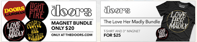 |
| Are magnets targeted mainly at the core older male audience? That's unlikely, but also bear in mind that all of this merchandise as well as directly generating revenue acts as ongoing marketing for the band too! |
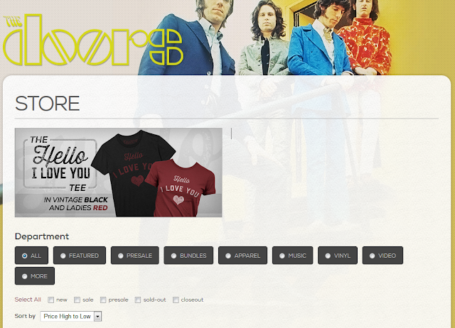 |
| The Doors' website has a 'store' link - music is just one of several categories, and its noticeable too that vinyl and video are in separate categories from 'music'. Note the effort to target both genders, with a 'ladies' tee featured in the sample product shot. |
The homepage of the Doors website. Note the features:
- LOGIN/MEMBERSHIP: See screenshot and caption below.
- MAIN IMAGE: Striking, and whilst not from one of their major album sleeves, this is currently pushing the Weird Scenes... album, using its cover. Presumably this changes to reflect any major campaigns. It reflects video conventions in a way by highlighting the singer over the band. Multi-layered, but all the elements rendered in the same painterly (water colour?) fashion; psychedelic; the band members appear as the presidents on Mount Rushmore.
- ACT LOGO: Note the size: its not overbearing; you've already chosen to come to this site, you don't need to be told its the Doors, so the logo isn't huge - though it is still the biggest font. Placement could be left or right, but along the top is conventional?
- LINKS LIST/SITE FEATURES: Seven main links, which will offer further options if you click into them. Clean and uncluttered.
- NEWS: A reason to return!
- THE BAND: Helps to inform casual browsers not (yet) amongst the core audience or fanbase.
- LIVE: 'The' band can't tour with dead members (though then again Michael Jackson managed that, and CGI concerts are now an established entity), but the surviving members do tour, and concert revenue is predominant for many acts today, not music. In this case, though, its an archive of past performances, including some available for purchase. See COMMUNITY for a note on audience interaction here.
- MUSIC: Nonetheless, the record label still wants to sell you music. Note the screenshots below: you get Amazon-style clickable track previews and four formats are offered ... including vinyl. Their debut album is out of stock; poor distribution? Furthermore, there are no links to download sites - perhaps they couldn't negotiate any revenue share from this (on top of standard royalties)? This is odd though, as it is especially the older male audience who would want high-definition audio - I'm a fan myself (and, yes, I'd fit as an 'older male'!) and have FLAC files, not just the standard MP3s.
- GALLERY: Hover and you get two options (as you do for other homepage links), gallery or videos. There are elements of this which would be exasperating if this was student work, never mind the official site of a band that continues to sell albums and merchandise around the world. The video section has a clickable years list (screenshots below), but I gave up after trying several of these with, apparently, nothing for those (so why list them?!?). I also thought it a little odd that there was no link to a Vevo YouTube channel [see note on ICONS]. Actually, the one video I tried carried an ad, in the form of sponsorship, plus the Flash popup at the bottom of the player made it difficult to reach the YouTube link to watch this on the YouTube website. Nonetheless, it is such video content that is a key driver of traffic to band websites; tour diaries and informal behind-the-scenes content as well as archive and even fan-shot concert footage is conventional.
- COMMUNITY: Simply crucial today. The 'former audience' generate key content. Again though, the curation of this website isn't great, with limited responses from the site reducing the range or volume of 'community' interaction. Check out this 'thread' - I spotted in the LIVE link that 'available content' tended to include 'posts', so had a look - and there isn't much (there is clear exasperation with the ignorance of the site creators though!).
- ICONS: Top right you have three icons: search, FAQs and Help. These last two seem odd - and actually take you to an external site, simply exposing the shoddy lack of care behind this site (in my view). The social media icons are generally what you'd expect (Facebook, Twitter, YouTube, Instagram, Google+) - though you could argue some are missing (Tumblr?), and of course if you're reading this much beyond 2015 then at least one of these will likely go the way of MySpace (once dominant, now barely seen), and new rivals will emerge. Indeed, Google+ is apparently being phased out as Google tries again to launch a Facebook rival. I clicked through to the YouTube channel, and noted icons for iTunes and Tumblr as well (plus a lack of channel description, and nothing in the 'discussion' link; again: poor!!!).
- COMPANY CREDITS: The website operator (also seemingly a ticket sales outfit); management company; and copyright notice, all along the bottom from left. Small fonts and icons, the icons are hyperlinked.
- AD FOR BAND PRODUCT: An example of band merchandise is highlighted, in a transparent frame.
 |
| Many band sites have paid-for memberships which in return provide exclusive music, pre-ordering of new releases and such; this one appears to simply require email details - valuable as a saleable commodity to online retailers and marketeers. |
 |
| The Facebook 'community' is vibrant; this isn't! |
 |
| Additional social media icons on YouTube, but note the lack of description (lack of care?). |
 |
| The 'Help' icon leads here. Poor branding. |
 |
| Multiple format options, poor distribution links? No downloads? |
 |
| Sponsorship on videos |
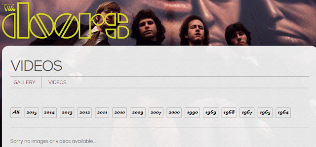 |
| Clicked on several years and ... nothing there! Poor design. |
 |
| Amazon-style track previews |
 |
| Social media icons, bottom right |
 |
| Search, FAQs, Help - the last two slightly odd choices? |
 |
| More evidence of poor curation of this b(r)and |
 |
| Company credits (hyperlinked with logo) and copyright statement. |
 |
| Sample merchandise is highlighted (the main image uses the album cover too). Note the transparency applied, an elegant design. |
...


No comments:
Post a Comment